ABSTRACT
Welcome to a new report from Nodecharts!
Since our last report, we have observed Bitcoin’s price rise from $70,000 to $90,000. In that report, we mentioned the strategy based on the Signals moving average crossover, which indicated that we were on the brink of a bull run. If you missed it, you can review it here: Link to the report.
However, we didn’t just point this out in our last report; for months, we have been indicating that the range in which Bitcoin’s price remained for 8 months was showing, based on on-chain data, a reaccumulation range.
As we have seen, Signals alone allows us to detect highly optimal entry and exit points. However, at Nodecharts, we always aim to optimize these strategies to offer on-chain data that allows our clients to maximize their investment returns.
To improve both market entries and exits, and as many of you may already know, we recently launched STUDIO PRO, a tool that allows us to add multiple indicators on a single chart. Today, we’ll analyze various metrics using a template created especially for advanced course students, which can be acquired by joining the course.
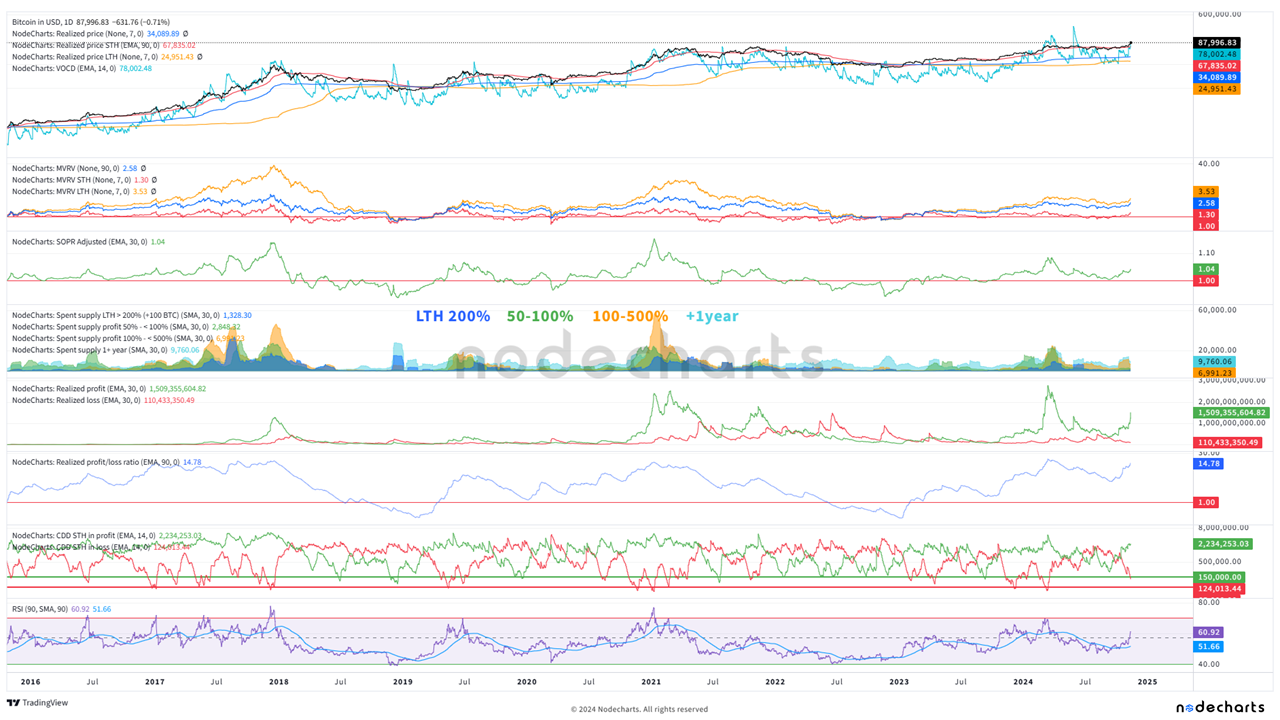
In the following image, you can see the complete dashboard. We’ll go through each metric to view the current network state and how we can detect a cycle end by combining them.
1. VOCD
The Value Coin Days Destroyed metric shows the price at which coins are being spent. During bullruns, it typically moves in parallel with the price. Caution is advised when this value significantly exceeds the price, as it could indicate profit-taking by long-term coin holders. In the current context, we see that this indicator has not yet reached concerning levels, suggesting that long-term investors remain confident in the market.

2. Realized Price
The realized price represents the average price that investors, in general, have paid for their bitcoins. In this metric, we want to see an increase, as shown in the image, since this reflects that the new price levels are being accepted by users entering the network.
A sharp increase, along with other metrics, can indicate moments of overbought conditions. This should always be considered together with other metrics, such as the MVRV. At the moment, we have just started to rise, indicating a gradual acceptance of the new prices by the market.

3. MVRVs
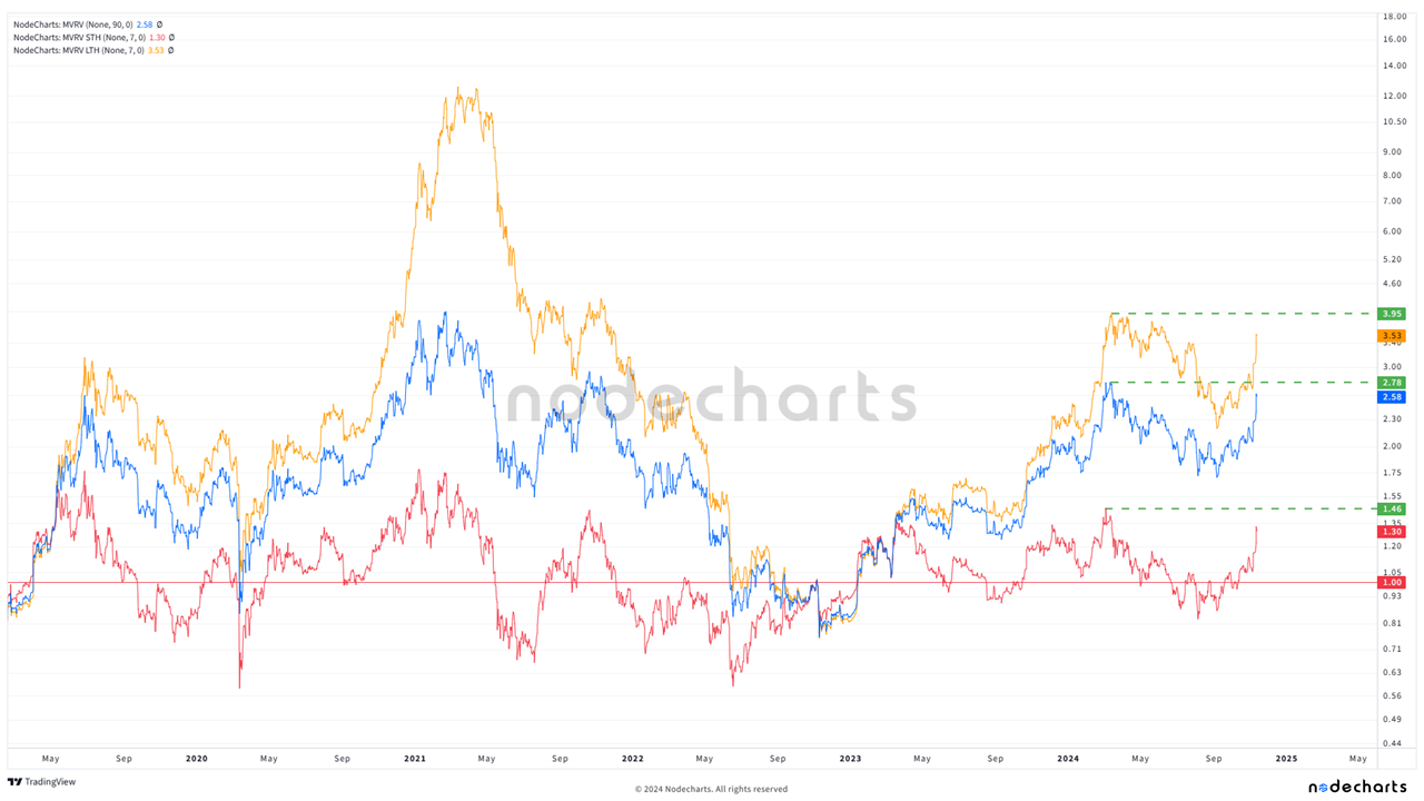
The MVRV is the ratio between market capitalization and realized capitalization (the same as market price to realized price). In this case, we have not yet exceeded the levels seen in March, and we are far from the values reached at previous cycle peaks. We believe it’s essential to monitor the simple MVRV levels starting from 3-3.5. It’s also important to observe the behavior of the Short-Term MVRV (ST) as the price advances. Additionally, if divergences appear between the price and MVRV, they could signal profit-taking.
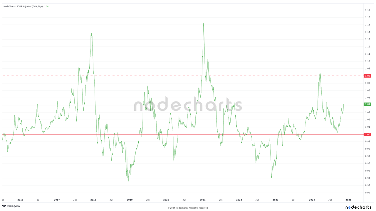
4. Adjusted SOPR
The Adjusted SOPR measures the realized profit or loss in transactions, excluding those that occur in less than an hour to remove short-term noise.
This indicator has marked fairly clear zones where the market has taken substantial profits in the past. Currently, the values are far from those levels. It will be interesting to look for divergences similar to those in the MVRV; that is, if the price increases and the metric decreases, it could indicate faster profit-taking, which would be a sign of waning confidence in the movement.
5. Spent Supply
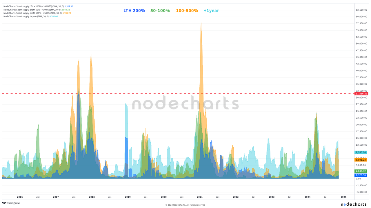
The Spent Supply analyzes the bitcoins spent, focusing on the age of the coins moving within the network, classifying them into different cohorts based on the time they’ve remained inactive or the profits achieved.
We have provided a legend to understand what each color in the chart represents:
- LP of 200% (blue): Low activity
- 50-100% (green): Low activity
- 100-500% (orange): Some profit-taking after breaking the range, which is common in bull runs but far from market peak levels.
- +1 year (cyan): Reflects the behavior of long-term holders (LTH). We compare this metric specifically with LTH 200% to see when LTHs of less than 1 year gain more than 200%, which typically occurs at cycle ends. We also have low activity.
At the moment, we consider the levels of all these metrics quite low, indicating that there is no significant distribution by long-term holders or users with substantial gains.
6. Realized Profit/Loss
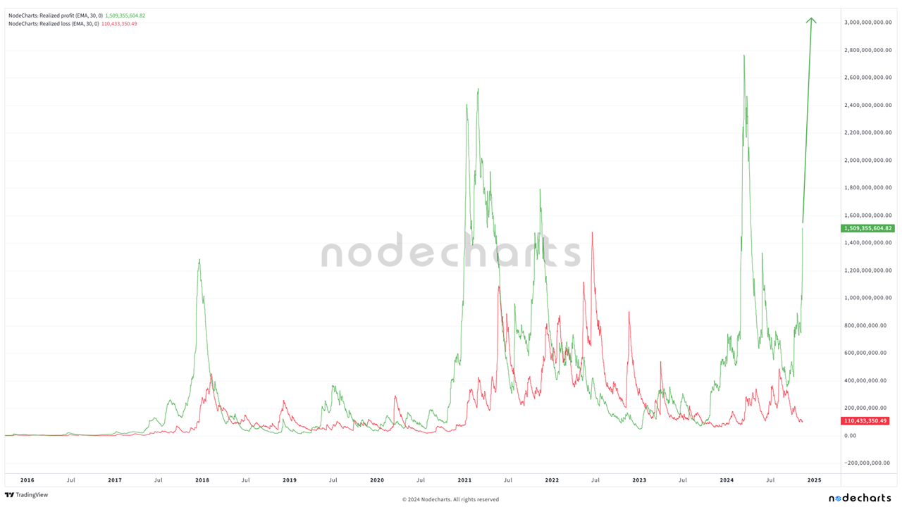
These metrics calculate the total realized profits or losses in dollars when coins move on-chain, providing insight into the general market sentiment.
Given that Bitcoin’s price increases over time, it makes sense for the values of this metric to rise as well. However, current values are very low, indicating that the level of profits taken is lower. This is a good indicator to compare with SOPR, as it suggests that there is still bullish potential before massive profit-taking occurs.
7. Realized Profit/Loss Ratio
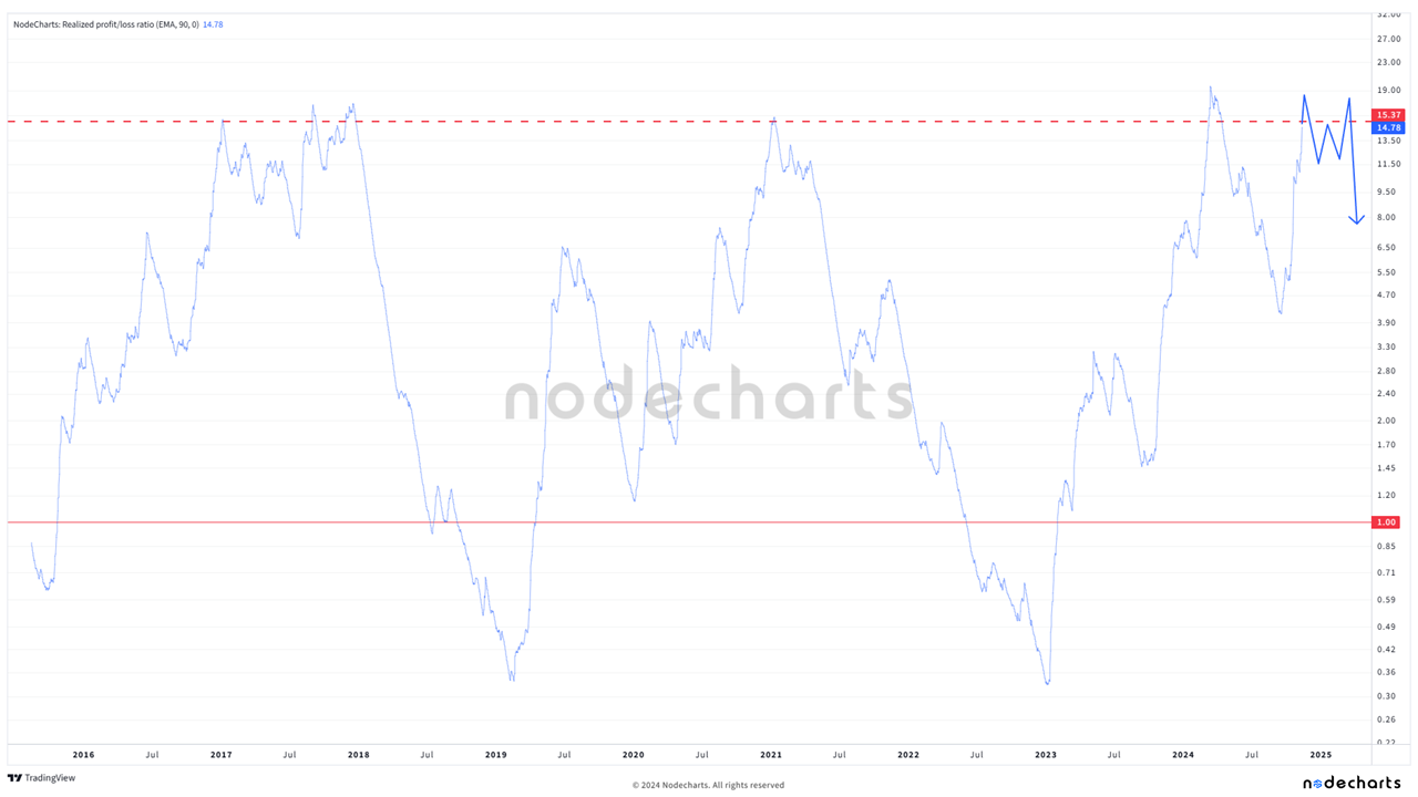
This ratio compares realized profits to realized losses, providing a measure of net market sentiment.
We have been questioning whether we will see a record in this metric. We observe two possible scenarios: a record in the indicator (the all-time high with a 90-day average is 18) or a range similar to what we saw in 2017 (represented in the attached image). Currently, we are watching how this ratio evolves, as a significant increase could indicate excessive optimism and potential corrections.
8. Short-Term Coin Days Destroyed at a Loss
This metric measures the coin days destroyed by short-term holders selling at a loss, and right now, we’re interested in knowing when few short-term users are selling at a loss.
Although the metric is decreasing with a 14-day average, current values are still far from the point where significant retracements have historically occurred. This suggests that, for now, we are not in a capitulation phase by short-term holders.

9. Short-Term Coin Days Destroyed at a Profit
Similar to the previous metric, but it measures the coin days destroyed by short-term holders selling at a profit.
Although it’s not completely inverse to losses, this metric is very similar but in reverse. We observe that we are far from reaching values that have indicated key points in previous cycles. Additionally, we look for divergences that may indicate that interest at these price levels is waning, which could be a signal to anticipate trend changes.

10. RSI
The RSI is a technical indicator that measures the speed and change of price movements, in our case considering the last 90 days.
Although this indicator is not directly related to on-chain, it reflects how much the price increases over a certain period. We should watch levels marked with circles in the image, and if divergences appear, it will provide an additional signal to consider profit-taking.

CONCLUSION
In summary, combining these metrics provides a comprehensive view of the current state of the Bitcoin market. While the price has seen a significant increase, several indicators suggest that we have not yet reached levels that have historically marked cycle ends. However, it’s essential to stay alert from now on and see how the metrics develop as the price advances.
On-chain data has proven to be essential tools for anticipating key movements in the Bitcoin market. Thanks to our analysis and advanced tools like ESTUDIO PRO, we can identify signals that alert us to potential cycle ends, as well as short-to-medium term trading opportunities.
If you want to deepen your knowledge and stay one step ahead in your investments, we invite you to join our advanced course. By signing up, you will receive:
- The STUDIO PRO template we reviewed today: A tool that allows you to combine multiple indicators in a single chart, facilitating a comprehensive market analysis.
- STUDIO PRO trading templates: Templates designed for hourly timeframes, optimizing your short- and medium-term trading strategies.
- In-depth explanations of all indicators: Not only those seen in this report but also many others essential for understanding the behavior of the cryptocurrency market.
Additionally, as part of our advanced course:
- You will have access to bi-weekly live sessions with our team of experts, where we analyze the market in real time and apply the strategies learned.
- You will receive the basic course as a bonus, complementing your learning and ensuring mastery from fundamental concepts to advanced techniques.
- You will enjoy the expert data plan, gaining access to updated on-chain metrics and analyses to help you make informed decisions.
- Access to the private student Discord
At Nodecharts, we are committed to the success of our clients. We know that knowledge is power, and our goal is to provide you with the tools and information you need to maximize your investments.
Don’t miss this opportunity. Join our advanced course or purchase one of our data plans and make the most of Bitcoin’s market potential. Prepare for upcoming moves and gain an edge with the best tools and support from industry professionals.
Disclaimer of Liability This article does not offer any investment advice. All data is provided for informational purposes only. No investment decision shall be based on the information provided herein and you are solely responsible for your own investment decisions.
