One of the most complex challenges for any investor is identifying the right moment to sell. In the crypto market, on-chain analysis provides us with tools to detect phases of retail market euphoria and periods of selling from institutional investors.
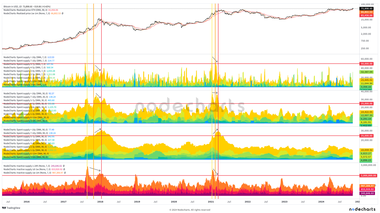
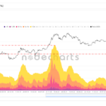
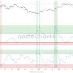
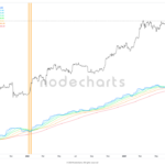
In the following chart, we analyze the behavior of bitcoins spent across different time-based cohorts in the first three studies and bitcoins acquired in the last one. Warm colors (purple to orange) represent short-term market participants, intermediate colors (yellow) indicate traders, while cool colors (green to blue) reflect long-term holders. The yellow, orange, and red vertical lines indicate key moments to consider exiting the market.
In the first study, we apply a 7-day moving average to bitcoins spent; in the second, a 30-day average; and in the third, a 90-day average. This helps us identify divergences between spending and price increases in the 7- and 30-day averages, as well as observe a sustained increase in the 90-day average, accompanied by a rise in bitcoins acquired and lower demand as prices continue to rise, suggesting a decline in market interest.
We detect the first point of significant sales with yellow vertical lines. This point should alert us, as it represents the initial sales from traders and large sales from long-term holders (notable in the 7- and 30-day averages), along with a strong increase in retail activity.
The second point is marked by orange vertical lines. Here, a decrease in sales from long-term holders (green-blue areas) is observed while prices rise, indicating a distribution phase by these investors. Stronger sales from traders are also evident, while retail buying activity loses momentum (warm-colored areas).
Finally, the red horizontal line indicates a pronounced divergence between price and sales, signaling an exhaustion of market momentum. In the 90-day average, high peaks suggest accumulated selling, marking the market’s peak. For the retail segment, clear divergences indicate a lack of strength to sustain the price.
