ABSTRACT
Welcome to the second Nodecharts research report.
This time, we would like to talk about profits, losses and profitability and introduce you to some metrics that we have recently added to our studio, which provide us with extraordinary information to find market bottoms and tops.
Before we dive into this analysis and put it in context, it is important that we clarify what we mean by profit, loss and profitability. This way we can make sure we are on the same page and better understand the conclusions we will reach together.
If we are talking about an investment in an asset, the profit refers to the capital obtained by selling the asset at a higher price than the price at which it was acquired. For example, if you bought bitcoin at $10,000 and sold it at $13,000, your gain would be $3,000.
In contrast, a loss occurs when you sell an asset at a lower price than you acquired it. Continuing with the example, if you bought bitcoin at $10,000 and sold it at $7,000, your loss would be $3,000.
Finally, profitability refers to the return obtained by the investor in percentage terms. To illustrate with the example above, if you bought bitcoin at $10,000 and sold it at $13,000, your return would be 30%.
Currently, there are various on-chain metrics that consider profit, loss or return on investment. It is crucial to differentiate between realized and unrealized profit/loss or profitability, i.e., between bitcoins that have not yet been spent (unspent) and those that have already been spent (realized).
As for unspent transactions, in this analysis we will focus on realized capitalization in profit, inactive outputs in profit and unspent outputs in profit.
In addition, at Nodecharts we have developed metrics based on spent transactions, such as supply spent in profit and outputs spent in profit.
Finally, to complete this analysis, we will also present new profitability-based metrics for both unspent and spent transactions. These metrics will allow us to obtain additional information to identify accruals and distributions. So don’t miss a single detail of this on-chain report!
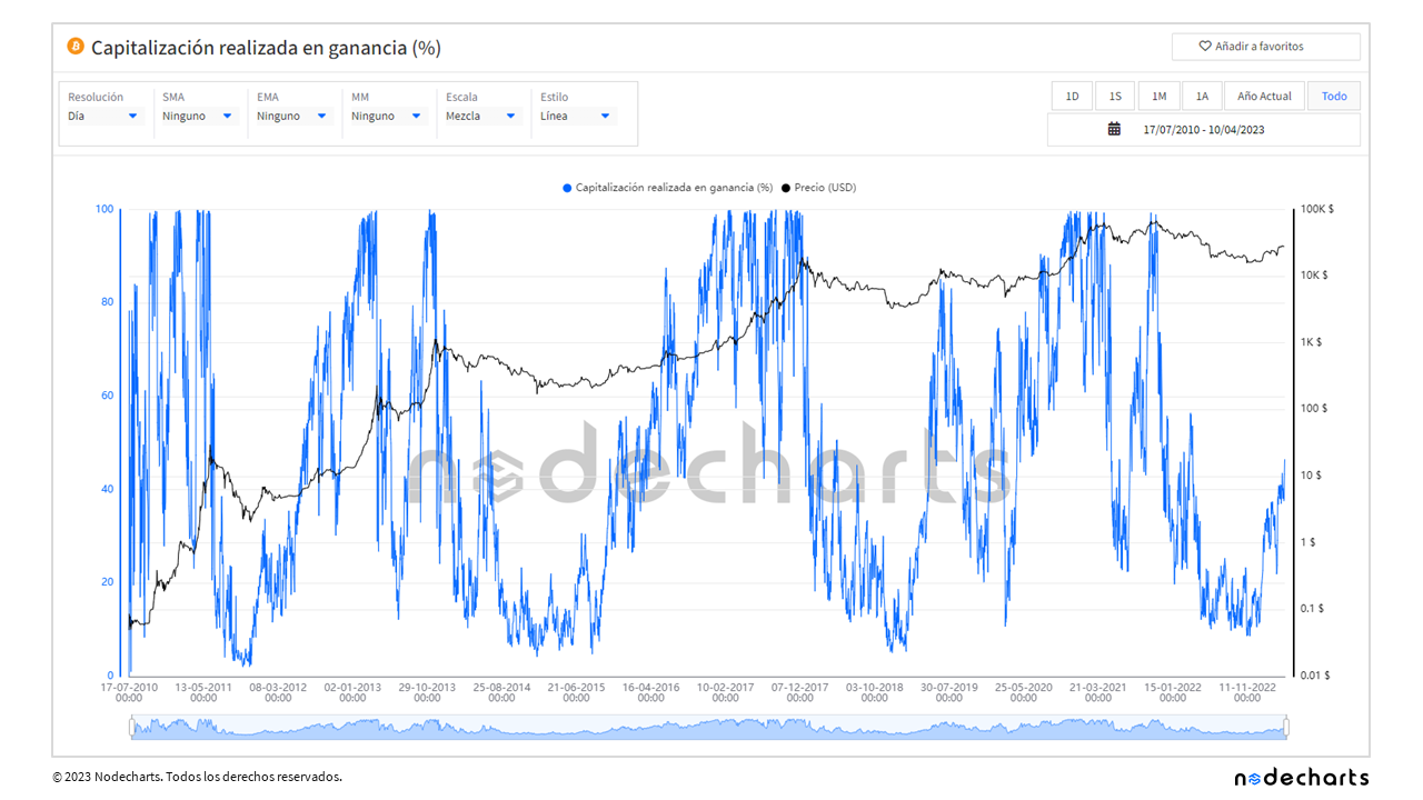
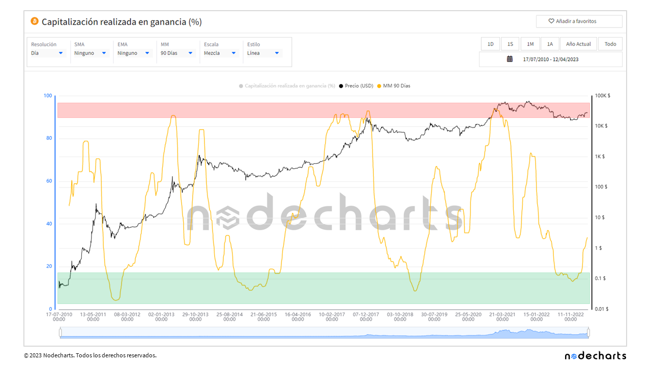
Realized capitalization in profit
Realized capitalization is an evolution of market capitalization, which in turn is a metric inherited from the stock market. Market capitalization is calculated by multiplying the bitcoins in circulation (supply) by their current price.
Realized capitalization instead is based on the acquisition price of all coins in circulation rather than using the current price. This measure gives us a more accurate idea of the current market valuation, as it takes into account the price at the time those coins were acquired.
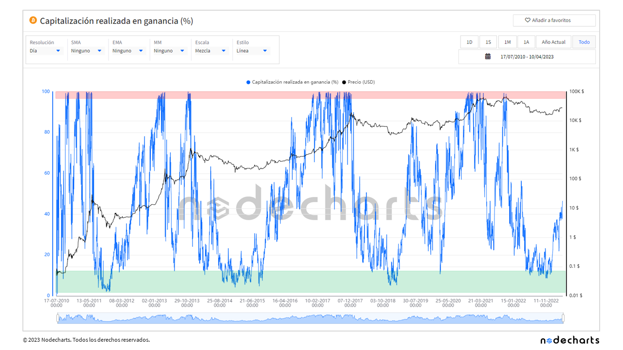
In the following chart we can see the percentage of the realized capitalization that is currently in profit, compared to the price at which the coins moved in the past
And here we can see the capitalization made in loss.
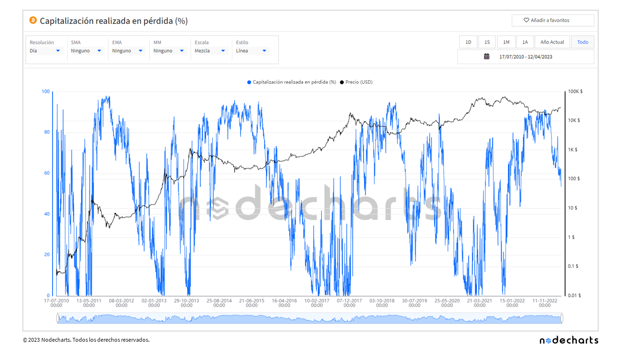
We will not show more metrics of losing transactions, since in most cases they are the inverse of the winning ones, due to the fact that unspent break-even transactions are scarce.
Next, we will analyze the most relevant areas where accumulations and distributions occur in the market.
• Accumulation values (historical 13 years): ≥ 11%
• Distribution values (historical 13 years): ≤ 98%
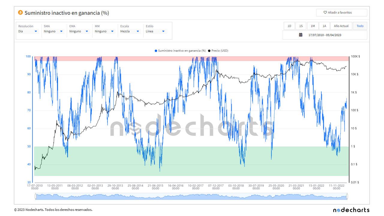
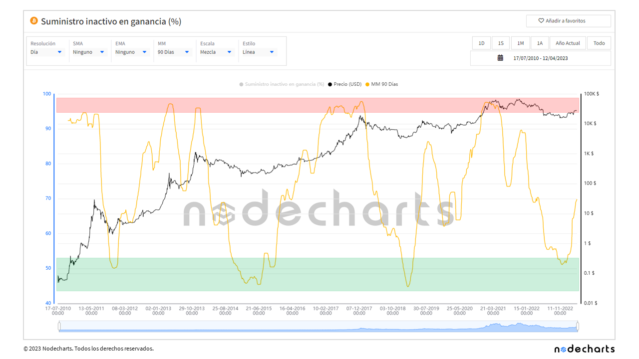
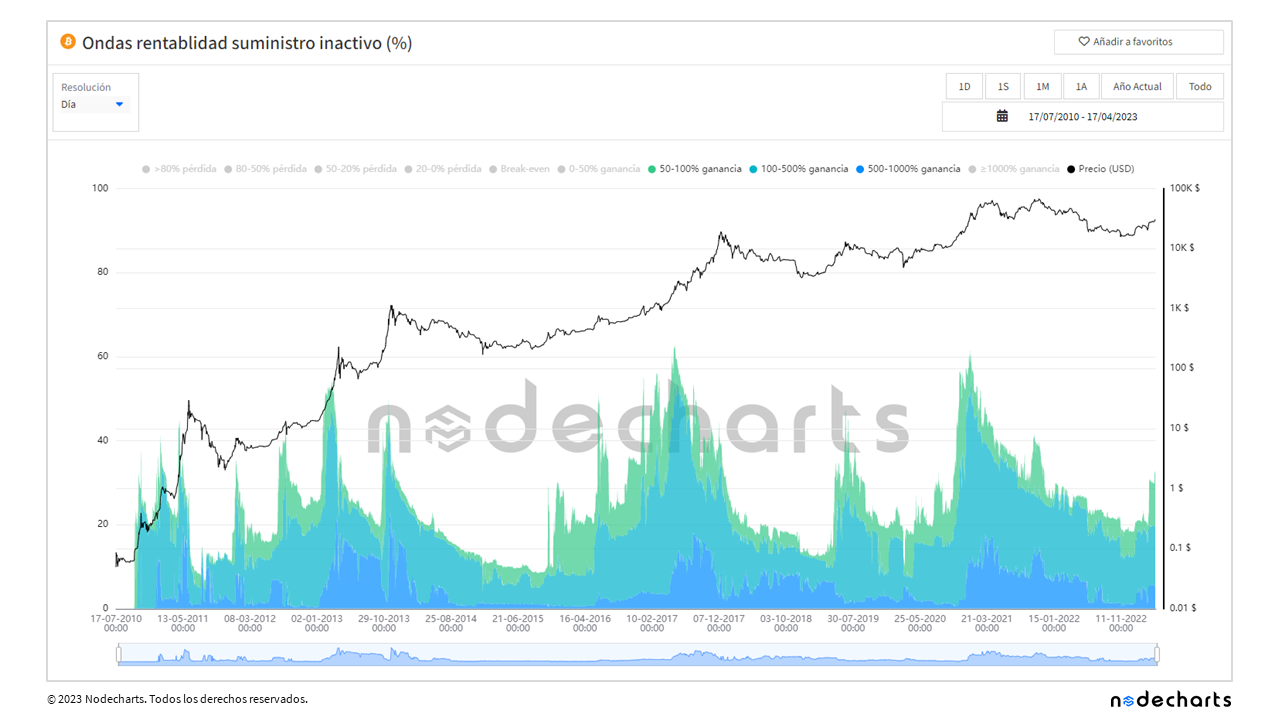
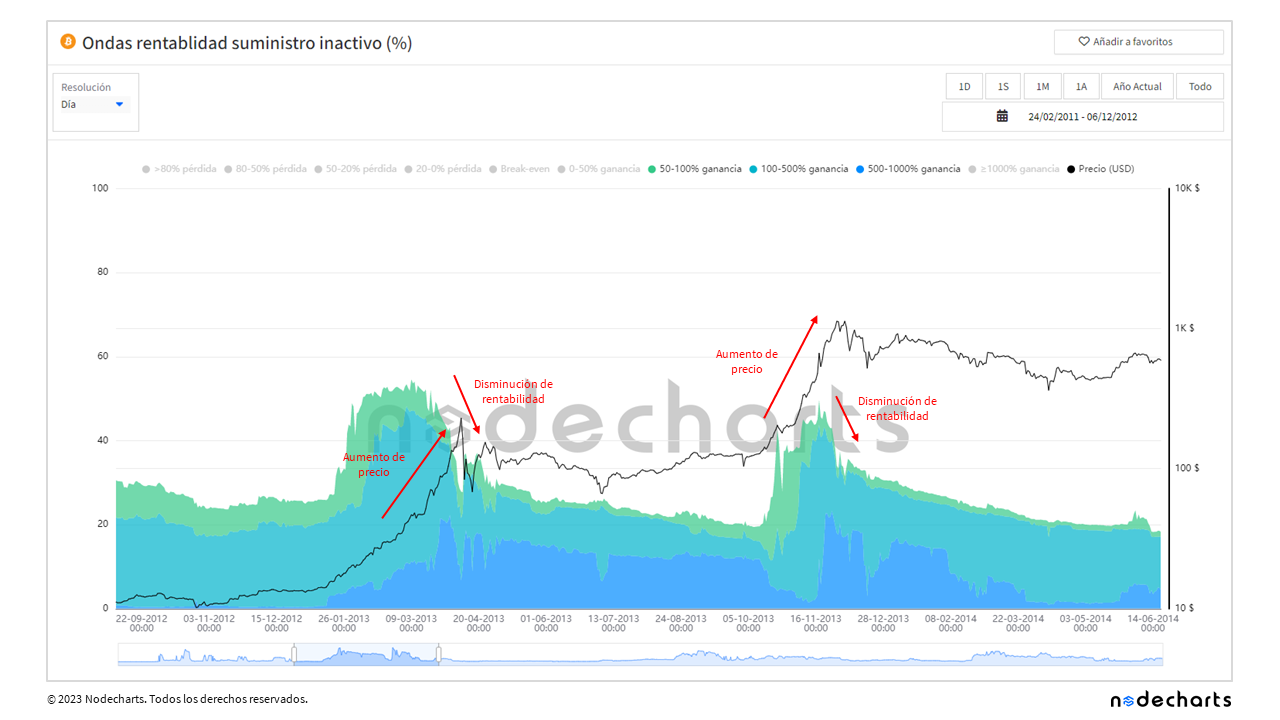
Inactive supply in profit
The inactive supply in profit is the percentage of unspent coins that were purchased at a lower price than they are at the moment.
• Accumulation values (historical 13 years): ≥ 50%
• Distribution values (historical 13 years): ≤ 98%
Unspent outputs in profit
Unspent outputs in profit represent the percentage of unspent transactions in which the current price is higher than the acquisition price at the time such transactions were made.
• Accumulation values (historical 13 years): Variable, we do not obtain a good reference point
• Distribution values (historical 13 years): ≤ 98%
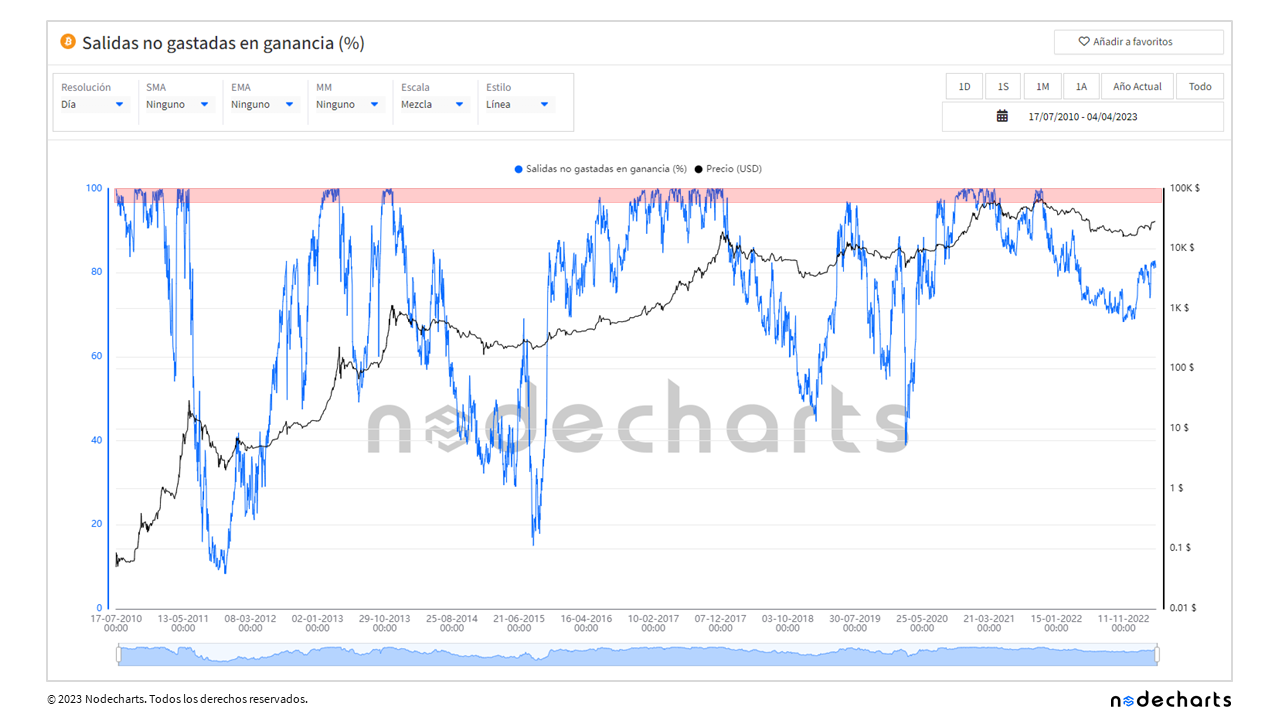
Looking at the three metrics of unspent transactions in profit, with the exception of unspent outputs, the accumulation zones (represented by green rectangles) have very accurately marked market bottoms. In contrast, while the distribution zones have also been accurate in all cycles, they have signaled too prematurely, as the market has continued to rise, keeping the win rate close to 100% for several months.
If we apply a moving average, in this case a 90-day moving median to smooth the metric, we continue to observe that the accumulation zones are clear, while the distribution zones have given premature signals in most cycles. Although with the help of other indicators and good capital outflow management, better results can be obtained.
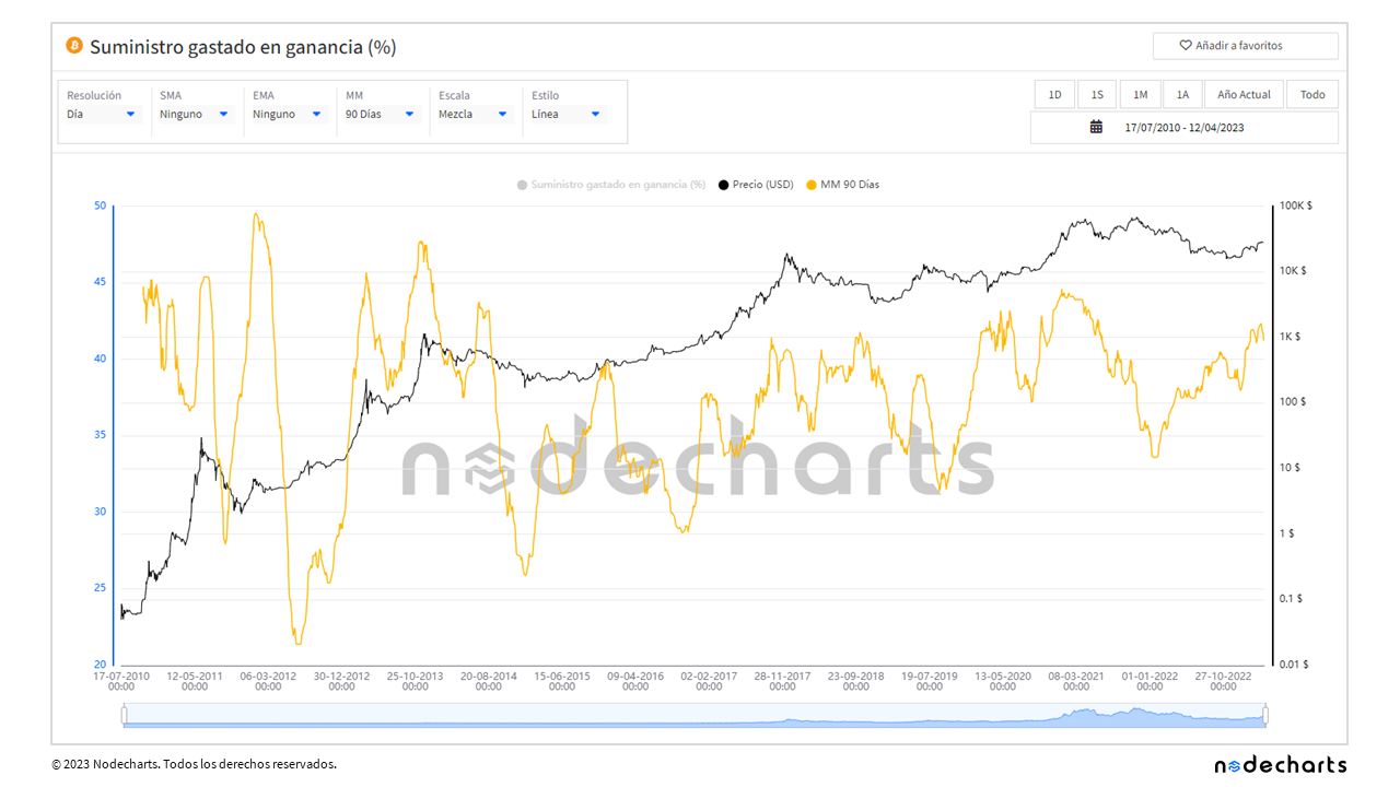
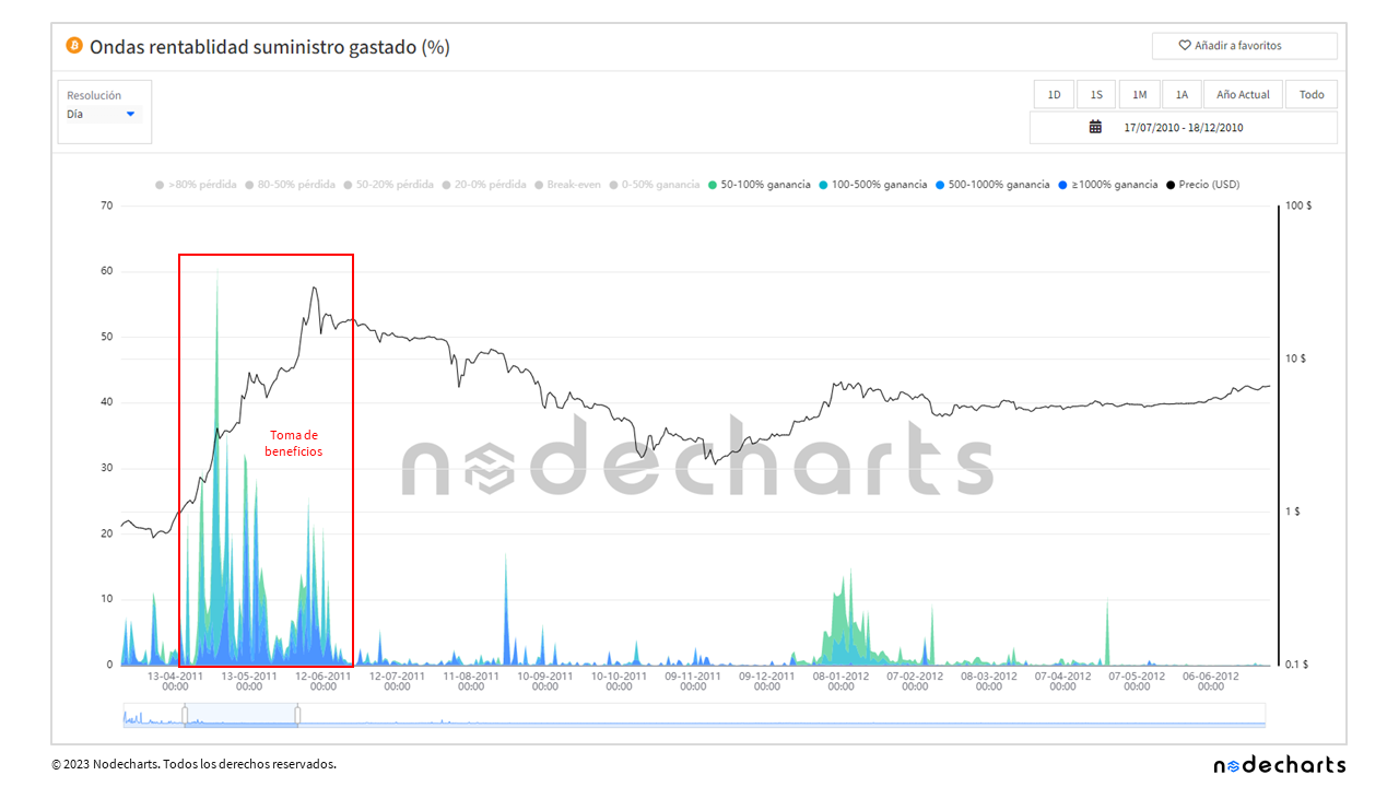
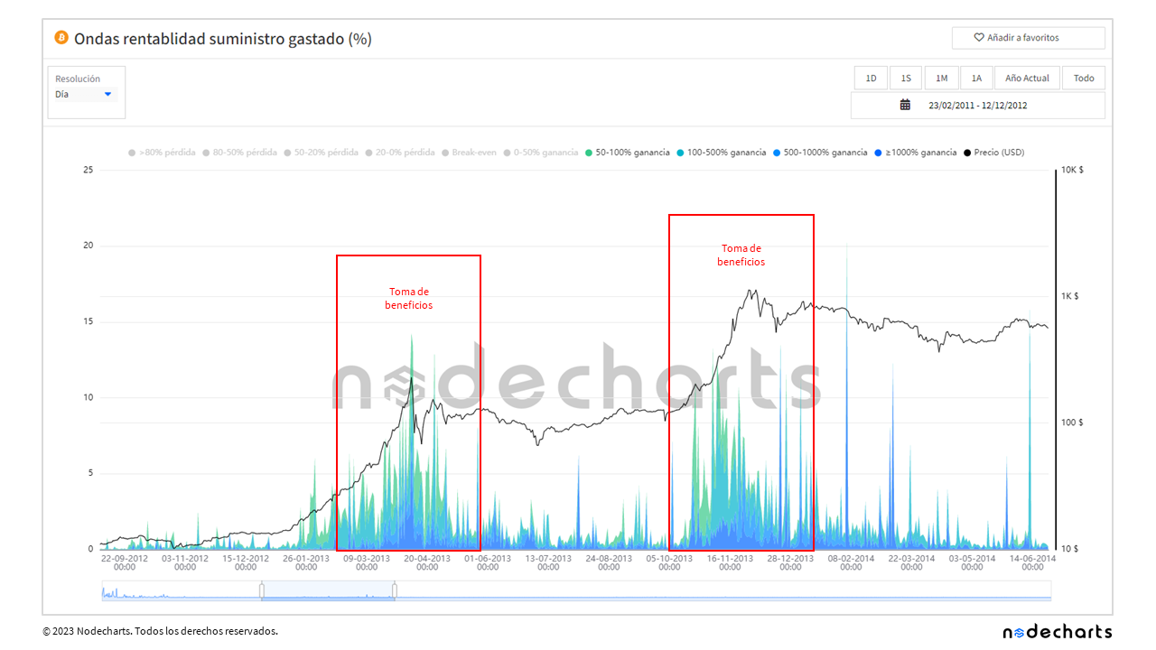
Next, we will explore the supply spent in profit and the outputs spent in profit.
Spent supply in profit
The supply spent in profit metric shows us the percentage of coins spent that were purchased at a price lower than the current price, meaning that a profit has been made. However, this metric does not provide us with information about the direction of the market nor does it help us identify possible accumulation or distribution zones. In short, although it is useful for evaluating the profitability of transactions already completed, it is not a relevant tool for predicting future market movements.
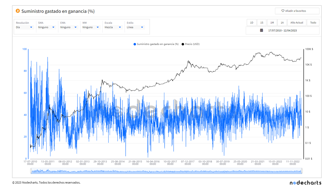
Even with the application of a 90-day moving median, it is difficult to identify relevant areas to make meaningful decisions based on this metric.
Spent outputs in profit
A metric that may be more useful is the spent outputs in profit, which represents the percentage of transactions that were spent at a higher price than the acquisition price. While it is still difficult to establish exact values to determine accumulation and distribution zones, this metric allows us to detect trend movements when the market is in a bullish or bearish phase.
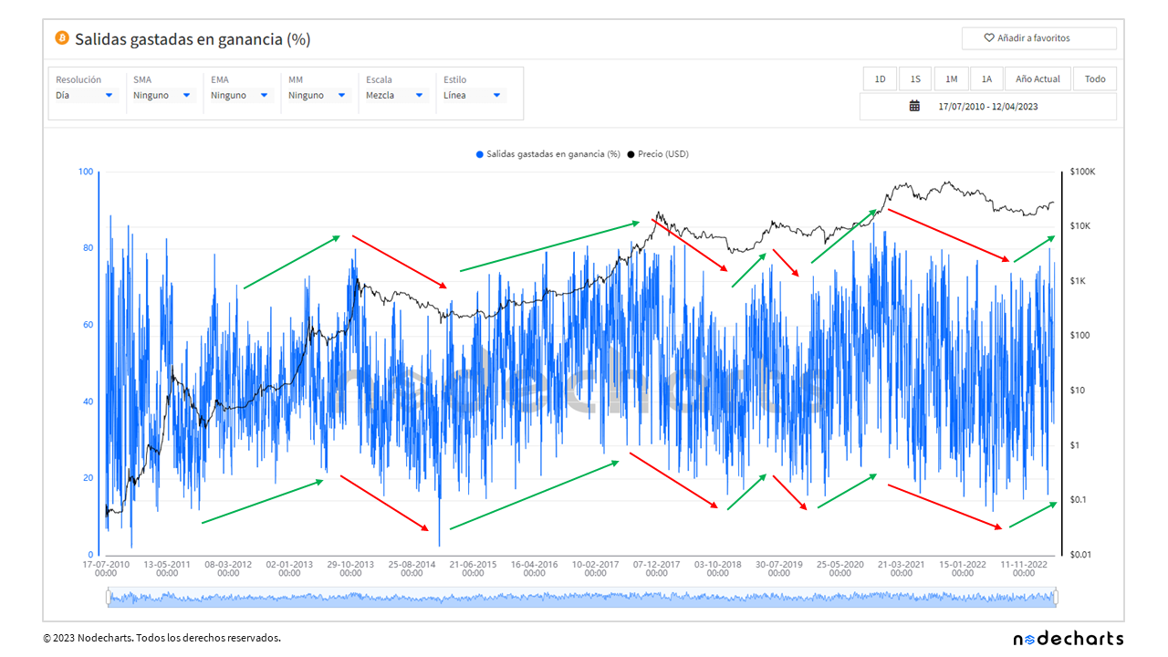
By applying a 90-day moving median, the uptrend or downtrend can be observed more clearly. However, it is still difficult to determine exact values to identify accumulation or distribution zones, as these values vary in each bitcoin cycle.

And as we mentioned at the beginning of the report, we will introduce the new metrics we have added to our studio based on cohort analysis of profitability.
A cohort analysis is a statistical technique used to analyze a group of individuals who share a common characteristic or experienced a similar event in a specific time period.
In our case, we have segmented the transactions into profitability groups for both negative and positive returns. This allows us to not only know how many transactions are in profit or loss, but also to divide to determine the percentage of profitability of each transaction.
Thanks to these new metrics, we have been able to find divergences between price increase and transactions with positive returns. This gives us valuable information for decision making and identifying accumulation and distribution zones with greater precision.
Realized capitalization profitability
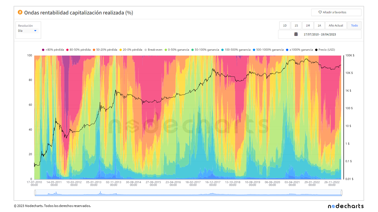
In this chart, each color represents a cohort that shares a common characteristic: the dollar return of the coins since the last time they moved. Let’s look at an example to understand it better.
Let’s imagine that someone bought bitcoins in 2020 at a price of $10,000 and still holds those coins in their portfolio (at a price of $30,000 at the time of the report). This person would be in the 100% to 500% cohort, as they have earned a 200% return.
So what is the advantage of using cohorts rather than simply looking at a profit or loss chart?
One of the main advantages is that cohorts allow us to filter out higher returns. For example, a transaction that is created and destroyed on the same day, even if it has a 1% return, would be counted as an in-profit transaction. With cohorts, we can filter and focus only on returns above 100%, which helps us identify trends and patterns of behavior in the market.
The following graph shows only the capitalization realized with returns above 100%.
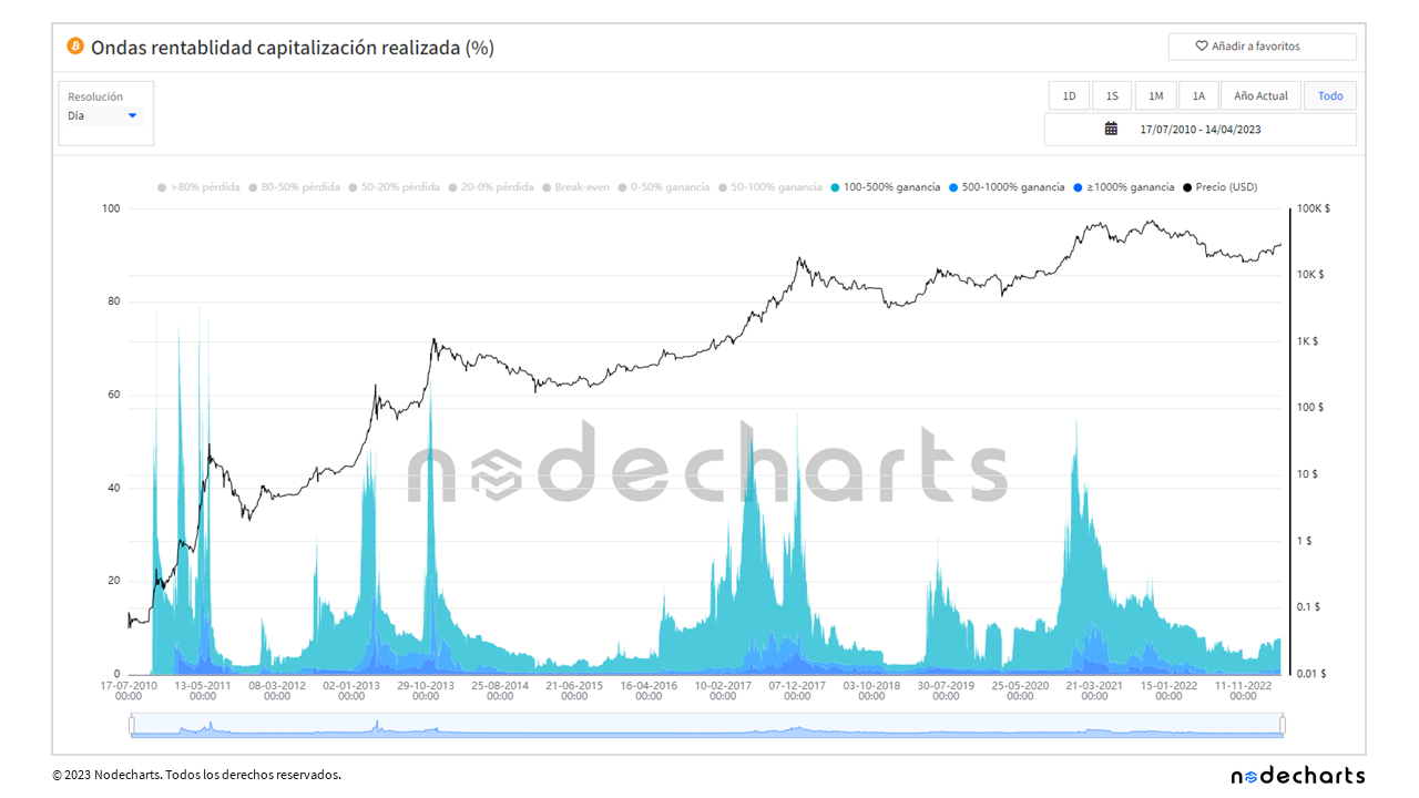
By looking at the chart, we can more accurately identify areas of market accumulation and distribution. In addition, we can determine when market tops and bottoms occur based on the proportion of transactions with returns greater than 100%. For example, when more than 50% of the market as a whole earns a return greater than 100%, market tops tend to occur. Conversely, when less than 4% of the market achieves returns greater than 100%, market bottoms tend to occur.
Profitability of inactive supply and spent supply
In the following chart, we will look at bitcoins with a return above 50% and discard returns above 1,000%, since most of the bitcoins with such high returns are lost and can never be spent. (Although not all bitcoins with returns above 1,000% are lost, as we will see in the profitability of spent supply, it is true that a large number of them are inactive).
How can we identify distribution zones in the Bitcoin market?
First look for divergences between increasing price and decreasing profitability, which may indicate profit taking.
Then analyze the profitability of the supply spent. In this way, we can detect possible accumulation and distribution moments in the market and make informed decisions.
Let’s take a look at what happened in 2011.
Profitability of inactive supply

In 2011, if we look at the inactive supply with returns above 50% but below 1,000%, we can see that the price increases while the return in that range decreases over the same period.
It is important to note that much of this decrease is due to the fact that many of the coins in this cohort have moved to profitability greater than 1,000%. However, in the following graph we will see that, during this period of decline, there are also supply spends with profitability above 50%.
Profitability of spent supply
During that same period when the price rises, but the profitability decreases, profits with returns above 50% can be observed.
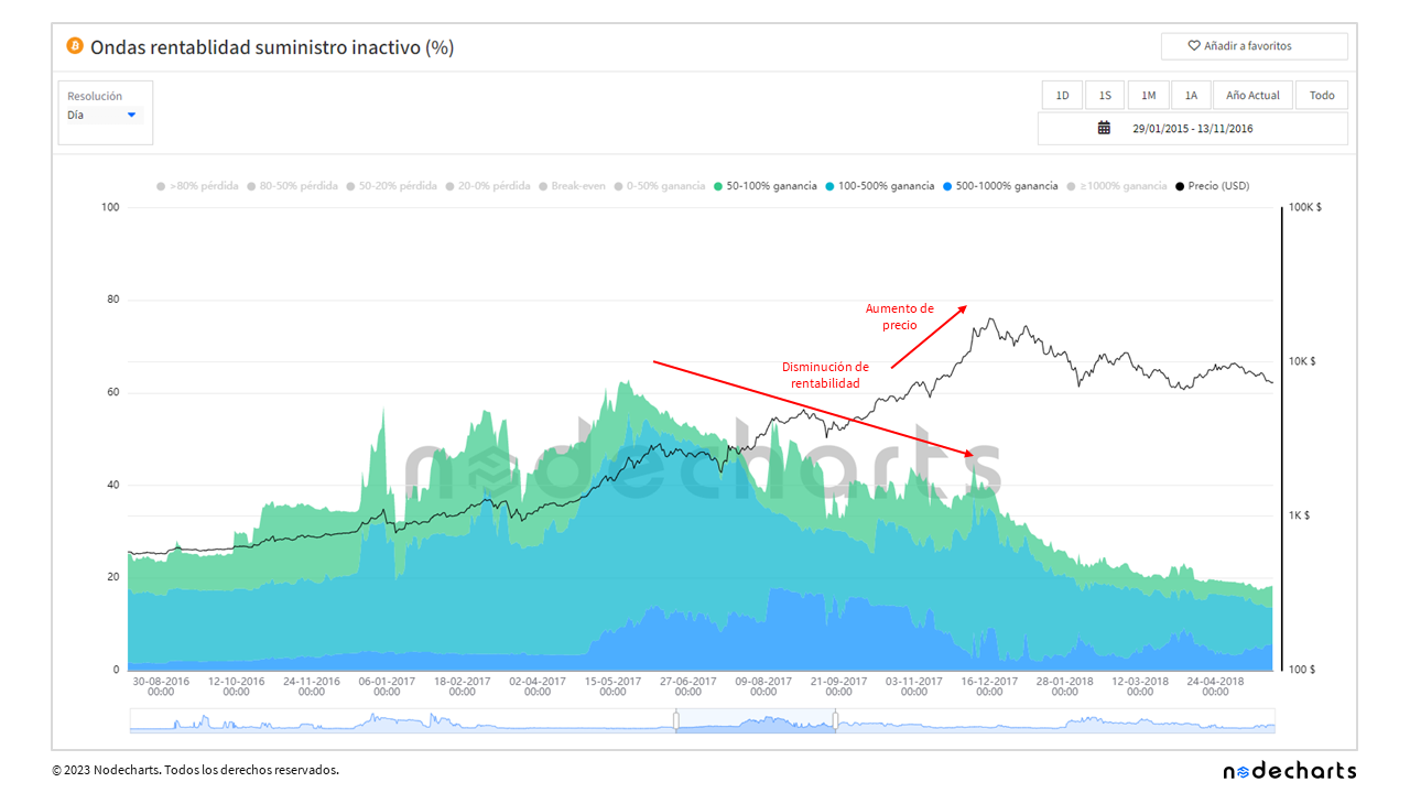
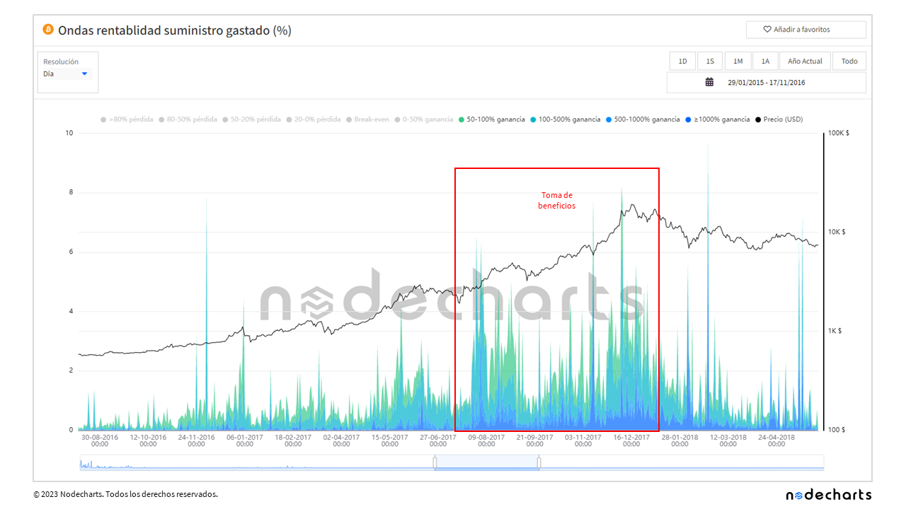
Let’s now talk about the 2013 market top.
Profitability of inactive supply
Profitability of spent supply
We can observe a similar pattern in 2013: an increase in the price of bitcoin, accompanied by a decrease in the return on inactive supply ranging from 50% to 1,000%, suggesting profit-taking by investors with returns greater than 50%.
During 2017, we observed similar behavior.
Profitability of inactive supply
Profitability of spent supply
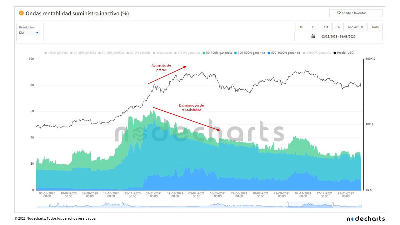
Finally, the same pattern is repeated in 2021.
Profitability of inactive supply
Profitability of spent supply
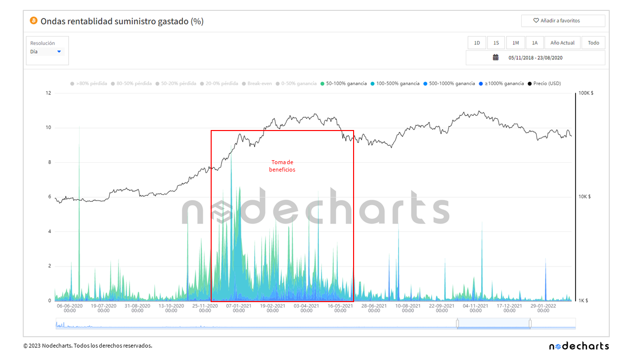
After analyzing different metrics of Bitcoin profits, losses and profitability since its inception, patterns have been found that indicate the existence of accumulation and distribution zones in the market. These patterns have been consistent over the years, both in 2011, 2013, 2017 and 2021, suggesting that they can be used as indicators for investment decision making and valuable tools for understanding Bitcoin market dynamics.
And that’s all for now! We hope this report has been helpful in better understanding the relationship between Bitcoin profitability and price over time. Always remember to do your own analysis and keep in mind that the crypto market is very volatile.
Disclaimer of Liability This article does not offer any investment advice. All data is provided for informational purposes only. No investment decision shall be based on the information provided herein and you are solely responsible for your own investment decisions.